Defect Reports Are Your Best Friend!
This post is adapted from an e-mail I sent to a CEO who was looking for project management tools to help deliver his products when promised. It summarizes how in the past his organization had successfully been able to know precisely where their product readiness stood. The example is for software, but trending defects will work well in managing projects of all types.
Do you really want to know how your product is doing?
Look at your defect arrival rate curve. Not the curve or chart of the “not yet fixed” software defects. The count of defects that have not yet been fixed is just the current difference between the defects reported and the defects repaired. The count of defects that have not yet been fixed is fairly irrelevant if the rate at which new defects are coming in is high and shows no sign of slowing down.
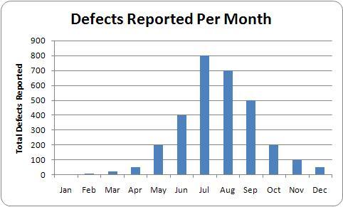
Software defect reports rise, peak and then fall in generally a bell shaped curve:
Look at and count the defects on a monthly basis or 4 week rolling average (i.e., how many defects were reported in January, February, etc.). Not on an hour, day or week basis. Look at six months of data at least. The trend will be obvious. If not, the data being shown is suspect (e.g., “filtered” too much).
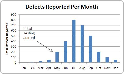
Software defect reports will RISE, peak and fall:
Your managers may try and “filter” the defects to show only the “critical” or “customer” or “will stop shipment” defects. In managing past products, I called this managing by the tip of the iceberg – but in fact this tip was well correlated with the hundreds and thousands of other defects that were also being worked. So filtering can be useful. Its primary use however was seemingly to give the more senior managers something to focus on and feel they are helping while the hundreds of engineers and line managers fix all the other issues. This significant jump in defect reports is a good indicator that testing has in fact started.
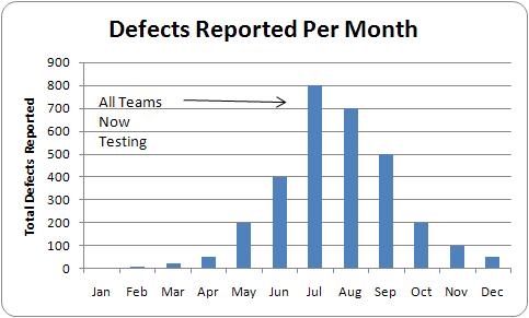
Software defect reports will rise, PEAK and fall:
Getting past the peak is a major milestone. Your leaders will show you the trend of the “important” software defects. Ask also to see the trend for all the software defects. All of them. This will help train your gut and will help keep them honest. Historically the defect arrival peak occurs just as everyone is testing (e.g., once system and operational testing start). So a key step is to get everyone testing. Yes, you will get a lot of defects being reported multiple times by multiple people. This is not a real problem, though many will tell you it is.
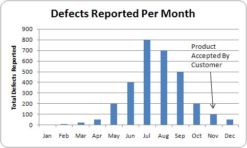
Software defect reports will rise, peak and FALL:
If the monthly trend is not falling, you are not yet half way through. The defect arrival rate does not disappear overnight. It takes months after the peak to get to a low and reasonable arrival rate. The significant defect arrival curve from beginning to end consistently lasted six to eight months (depending upon the product line) before acceptance by the customer. There is always a low level of defects coming in on any product. For these products, a “low level” was generally under 100 defects arriving in a month (all defects, not the “important” or “critical” or otherwise filtered subset).
The defect report trend was the single best indicator of where a product was in its lifecycle. I could glance at any product’s trend and immediately know how far along they were. It was the best predictor in the last half of the product development lifecycle for when the product would be accepted by the customer.
Every company and product line is different. However, tracking and understanding how your defects are detected and repaired over time is a tremendous project management tool. Simply count the number of defects that get submitted each period. Don’t try to “clean up” or “filter” the raw count in any significant way. Track this from the first defect reported through the introduction of the product and even until the product’s retirement. Once you have a few of these curves developed for recent past products, it will help you to better understand where your current product really is in its development cycle.
18 thoughts on “Defect Reports Are Your Best Friend!”
Comments are closed.


There is one part of the data missing that I would like to have seen in correlation, and that is testing hours. I’d bet dollar to donuts that the reason why there is a bell curve is not because the software that gets delivered to the testing team in the middle of the cycle has more bugs, but rather that the testing team only swing into full motion in the middle. In the beginning, only a little of the product is delivered, and in the middle most of the product and in the end the outstanding bit. That is why you get a bell curve. If you would overlay the amount of testing hours the QA team logged, you will most likely see that it is a constant. Say, for every 100 test hours logged, you got 100 errors, and it stays very much a constant, with a slight deviation, say 90 to 110 per 100 hours. I doubt very much that the software that was delivered in the beginning of the testing cycle had less errors.
Leonard,
Absolutely. The bell shape comes from more hours and “peeling the onion” of functionality that is tested. The initial rise was when system test started. The peak was usually when field testing (testing in the customer environment – see the comment on the chart) got started. So the bell shape was indicative of this organization and how it tested. For other organizations it might be more skewed, where we see an early peak and then a decline with time as issues are uncovered and fixed.
I’ve not observed that errors reported are proportional to hours tested. My experience has been a fairly consistent rise, peak, fall – but the shape of the curve is a team+process+product characteristic. I could believe that if all defects were equally identifiable (i.e., if tested we would find and report the error) then we would see a proportional relationship. What I’ve observed is that initial defects mask other defects and so until one it fixed the others cannot be detected (and often, not all functionality is completed and delivered by the time testing starts). The 2nd major dynamic I’ve observed is that as defects are fixed, these fixes can cause other defects and so we see “fixes” generating defects (e.g., a lot of fixes is associated with a “bump” in the number of “new” defects found). The final major dynamic I’ve observed is when the software is fairly defect free (from obvious defects) then we’ll start to see more defects and fixes for long term issues such as memory leaks, complex feature interactions, network/latency related issues, other time driven issues and performance issues. These dynamics would appear to conspire to cause the rise, peak, fall, where especially the fall can be slow and long.
Great comment. Thanks.
Bruce
Nice post! Great explanations of defect charts. I set one up for the Custom CMS that my team was maintaining and found that it was incredibly valuable in tracking how the system was doing and showing progress to stakeholders.
Dina,
Good to hear. I find the more objective I can be in presenting status, the easier it is to see and fix real issues.
Thanks
Bruce